
Soulbit
Soulbit was an early-stage brand operating within a financial and blockchain ecosystem, with an existing visual foundation that needed greater consistency, clarity, and maturity. The engagement focused on refining that foundation into a more cohesive brand identity — one capable of communicating trust, technological confidence, and contemporary relevance without becoming cold, overly artificial, or visually speculative.
STRATEGY
The visual language of Web3 and blockchain brands is often dominated by highly technological, artificial, and speculative codes.
For a brand operating within a financial context, the opportunity was to find a more balanced expression: visually credible enough to communicate solidity and technological capability, while remaining human, approachable, and easy to understand.
The creative direction therefore focused on building trust through clarity, consistency, and restraint rather than relying on the more exaggerated visual conventions commonly associated with the category.
LOGO
The existing logo already had a recognizable visual foundation, but required greater precision and consistency across different brand applications.
Its construction was refined on a grid, adjusting proportions, spacing, and small details to improve legibility at reduced sizes while preserving the character and recognition of the original mark.
Rather than reinventing the symbol, the objective was to strengthen what was already there and make it more reliable as part of a broader visual identity system.


COLOR SYSTEM
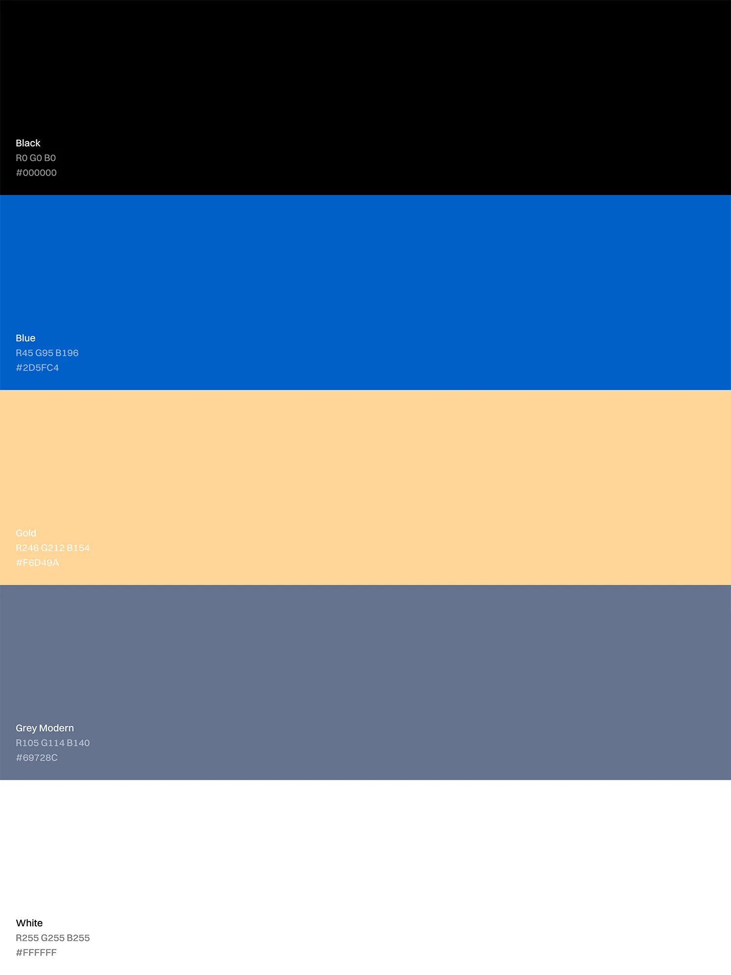
The color system needed to express Soulbit’s technological character without pushing the brand toward the overly speculative visual codes often associated with the sector.
The palette was refined to work consistently across brand communications, digital environments, interface states, and different levels of information, while maintaining a recognizable visual hierarchy.
Color became an important part of the brand language: a tool for creating distinction, reinforcing consistency, and balancing technological precision with a more approachable visual tone.
TYPOGRAPHY
Typography selection was driven primarily by functional criteria. For an MVP context, the priority was choosing readily accessible resources that simplified implementation without compromising the brand’s personality.
We worked with Inter and Funnel Sans, both available through Google Fonts, to ensure readability, efficient implementation, and visual consistency across digital applications. While Inter supports continuous reading and information-dense environments, Funnel Sans brings a more distinctive, tech-forward character to headlines, with geometric traits that visually connect with the logo’s construction and help maintain coherence across the broader brand system.
DIGITAL
Photography
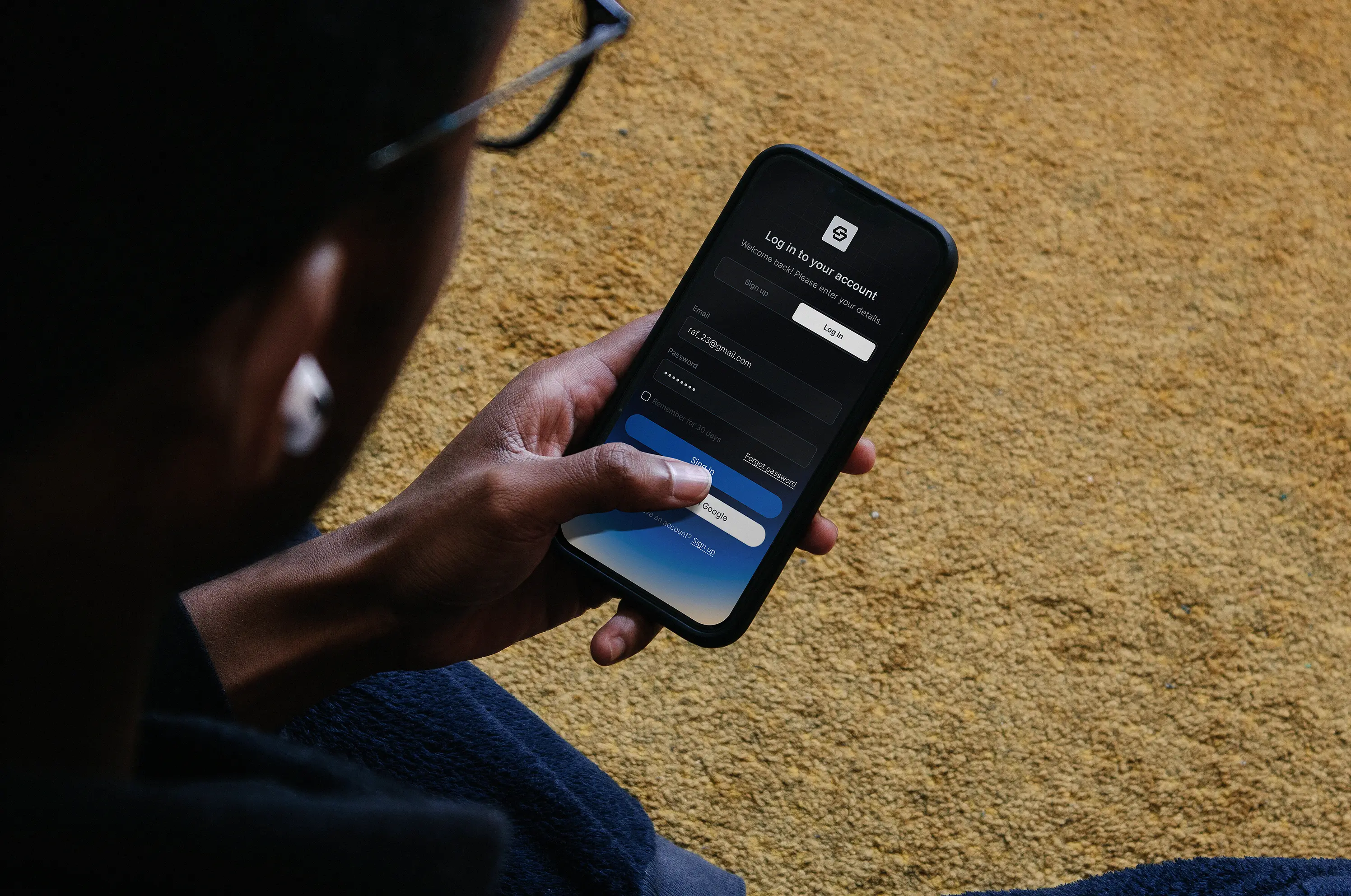
Photography was directed as the primary human counterpoint to the brand’s technological language.
Against a system dominated by deep blues and digital cues, natural sunlight became a recurring visual device — introducing warmth, familiarity, and a sense of everyday realism.
The imagery focuses on relatable moments and environments, helping the identity feel more approachable without losing the level of sophistication expected from a financial technology brand.
Visual & Motion Assets
Motion and visual assets were explored as extensions of the core identity, testing how the brand language could behave beyond static applications.
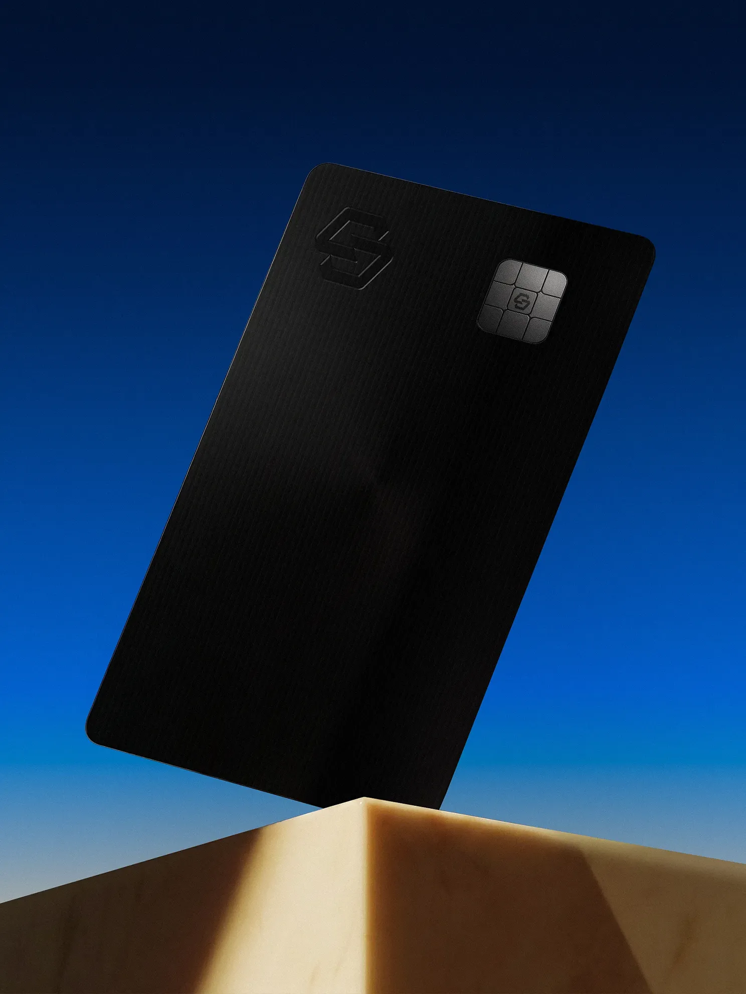
Movement, dimensional compositions, 3D elements, and card-based layouts were used to explore rhythm, hierarchy, depth, and visual storytelling across digital contexts.
Some of the visual explorations shown in this case study were developed as later conceptual extensions, allowing the identity to be studied beyond the boundaries of the original deliverables.
UI / System
The visual identity was also translated into a basic modular UI kit, using foundational components such as buttons, inputs, cards, navigation elements, tags, states, and other reusable interface patterns.
The purpose of this work was not to define a complete digital product, but to demonstrate how the brand’s visual principles could remain consistent when applied to interface-based environments.
This initial system served as a visual reference that could later be interpreted, adapted, and extended by product and development teams according to their own functional requirements.
The interface compositions shown throughout this case study include later conceptual explorations developed to study the potential evolution of that visual language. They should not be interpreted as representations of Soulbit’s current product, internal architecture, proprietary workflows, or production interfaces.


CREDITS
Creative Direction and Design:
Marlon Garay, Nicolás Aguirre
Project Manager:
Mileidy Polanco
Category
Brand Identity
Client
Metlabs Blockchain
This case study documents the creative contribution, design methodology, and subsequent visual exploration developed around the Soulbit identity following an original branding engagement through Metlabs Blockchain.
The original scope focused on visual identity refinement, a basic modular UI system, and selected digital applications. The corresponding baseline deliverables and editable source files were completed and delivered separately.
Certain visual elements developed or refined during that engagement — including color, typography, logo refinement, and foundational UI patterns — have since been implemented and made publicly accessible by Soulbit through its own website and public-facing channels.
The UI-related work consisted primarily of reusable visual components such as buttons, inputs, cards, navigation elements, tags, states, and similar interface primitives intended to guide future implementation by product and development teams. These components should not be interpreted as complete product layouts, proprietary product architecture, or finalized application flows.
Some visuals, mockups, interface studies, 3D applications, and system extensions shown in this case study were developed later as independent conceptual evolutions based on that publicly visible visual language. They were not part of the original paid scope or contractual deliverables unless expressly identified otherwise.
Generic labels and structures such as “Primary”, “Secondary”, “Section”, “Item”, “Container”, buttons, cards, tables, charts, navigation, and asset lists are used as neutral design-system conventions and common interface patterns. Their appearance does not represent or disclose proprietary Soulbit functionality, business logic, internal user flows, technical architecture, or unreleased features.
The conceptual applications shown here are presented solely for portfolio, educational, methodological, and professional-reference purposes. They should not be interpreted as released product interfaces, production-ready software, internal product documentation, roadmap material, or accurate representations of Soulbit’s current digital product or commercial implementation.
This case study does not intentionally disclose source code, backend architecture, databases, credentials, private technical documentation, internal business processes, non-public commercial information, or other non-public technical assets belonging to Metlabs Blockchain, Soulbit, or any third party.
Any pre-existing names, trademarks, logos, brand assets, product rights, or other third-party materials remain subject to the rights of their respective owners. This publication does not claim ownership over rights belonging to Metlabs Blockchain, Soulbit, or any other third party.